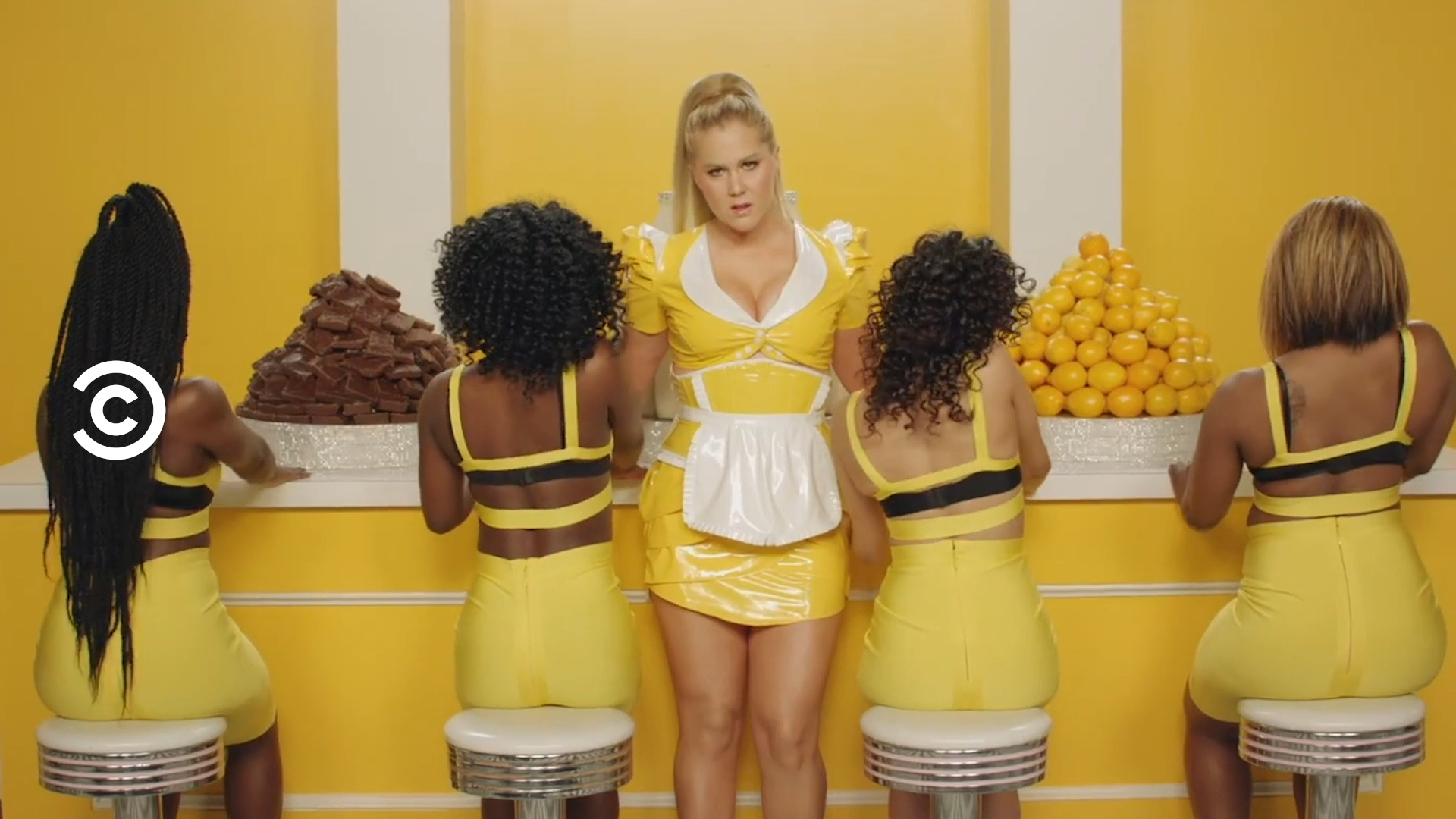
Comedy Central’s last brand refresh was in 2011. Since then a lot has changed. In today’s multi-platform landscape, if something smells promotional, you’ll swipe right past it. In this climate, how do we deepen brand equity, attribution and inspire creative expression across all platforms? Our mantra:
How? Well it starts with a flexible system that sits atop an ever-evolving blank canvas.
The system adapts to the needs of various platforms, working to connect the Comedy Central brand to its creative content, but always in a simple and direct way.
Our goal was to communicate information to the viewer in a way that would maximize time spent on punchlines, not endcards. Ultimately we aimed to NOT MAKE PROMOS, or more precisely to redefine them as FUNNY CONTENT in and of themselves.


To support this system, we refined the Comedy Central logo, built a custom typeface and committed to a hero color for the brand.
Our strategy was supported by the creation of a custom typeface for Comedy Central that could be used everywhere, replacing Brandon Grotesque, a typeface used by many other brands. Its condensed design allows it to be bold even when placed in tight spaces, supporting a streamlined navigational system.

We streamlined and emboldened the mark, improving its visibility at any scale. We paired it with custom type and simplified the lockup options with a bolder approach that, especially internationally where attribution is still building, brings more weight to the name of this iconic brand. Although our new type is condensed, we connected to the mark by echoing its angles within the C letterform.
To increase cross-platform attribution, we moved away from Comedy Central’s broad multi-colored palette. Our new signature color helps anchor the brand and the new navigation system. Although the full brand palette does include some additional content-inspired complementary colors, Summer Ale provides the home base for the brand.


