
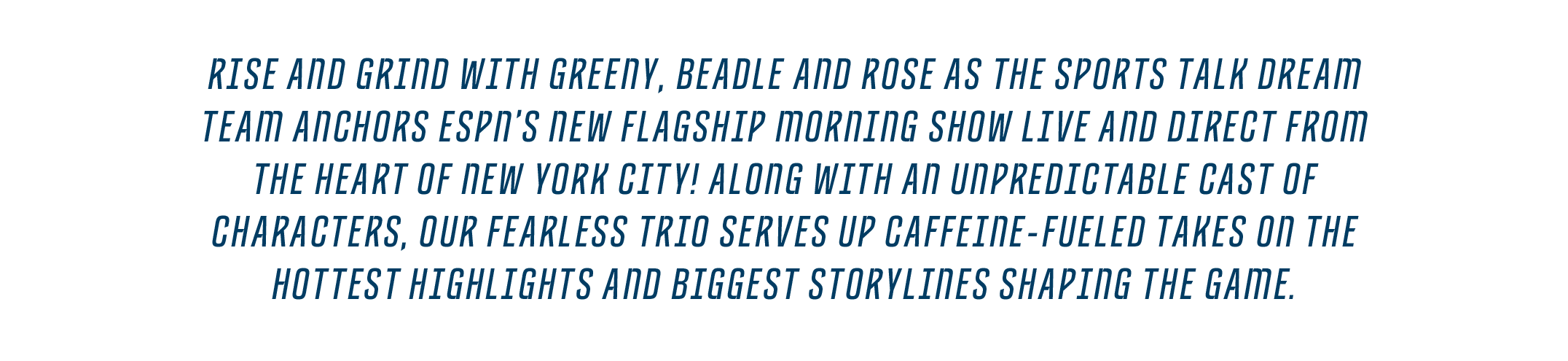
There’s nothing we love more than the opportunity to build a brand from scratch. So when our longtime co-conspirators at ESPN asked us to partner with them to launch their new flagship morning show, we kick-started the coffee maker and got to work.


Well, quite a bit!
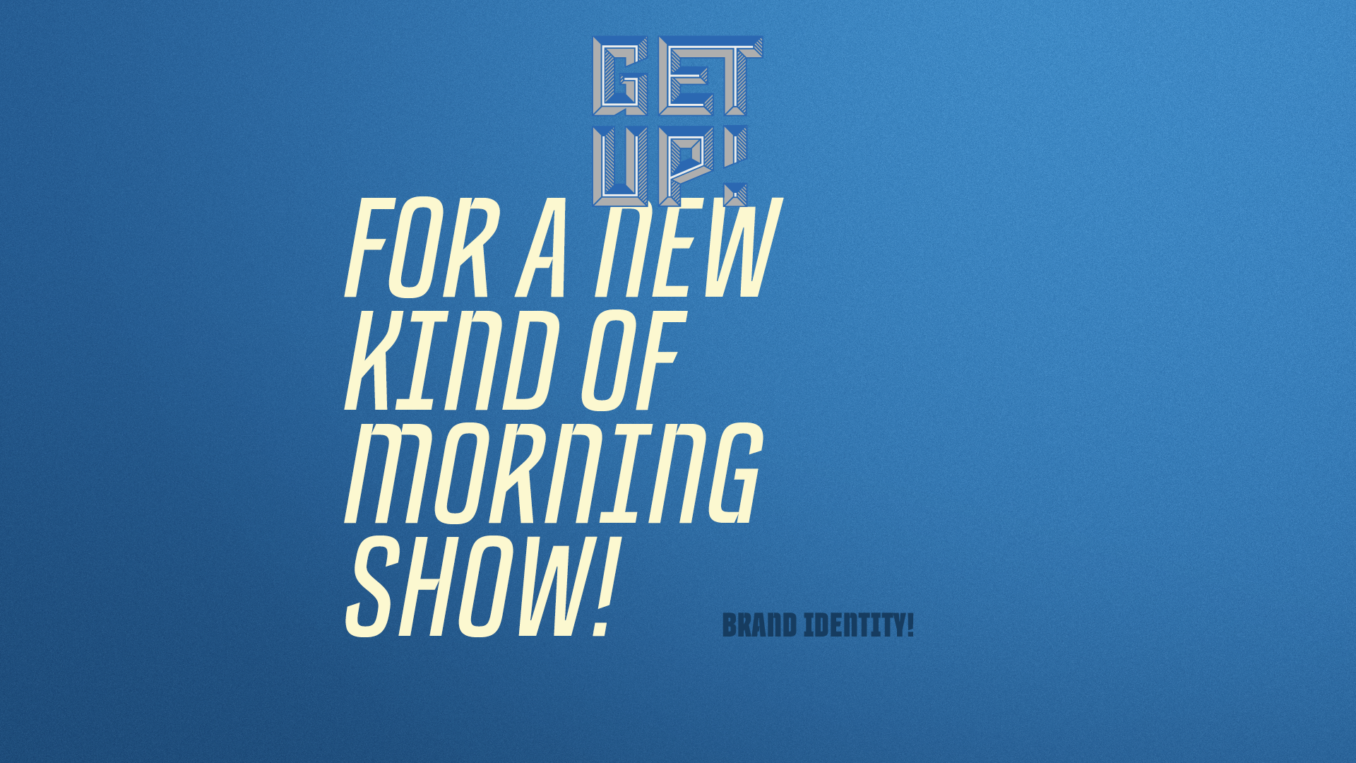
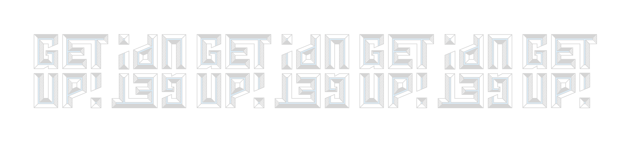
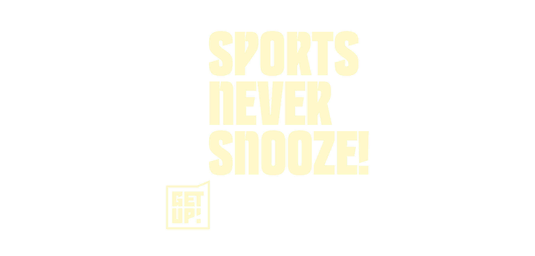
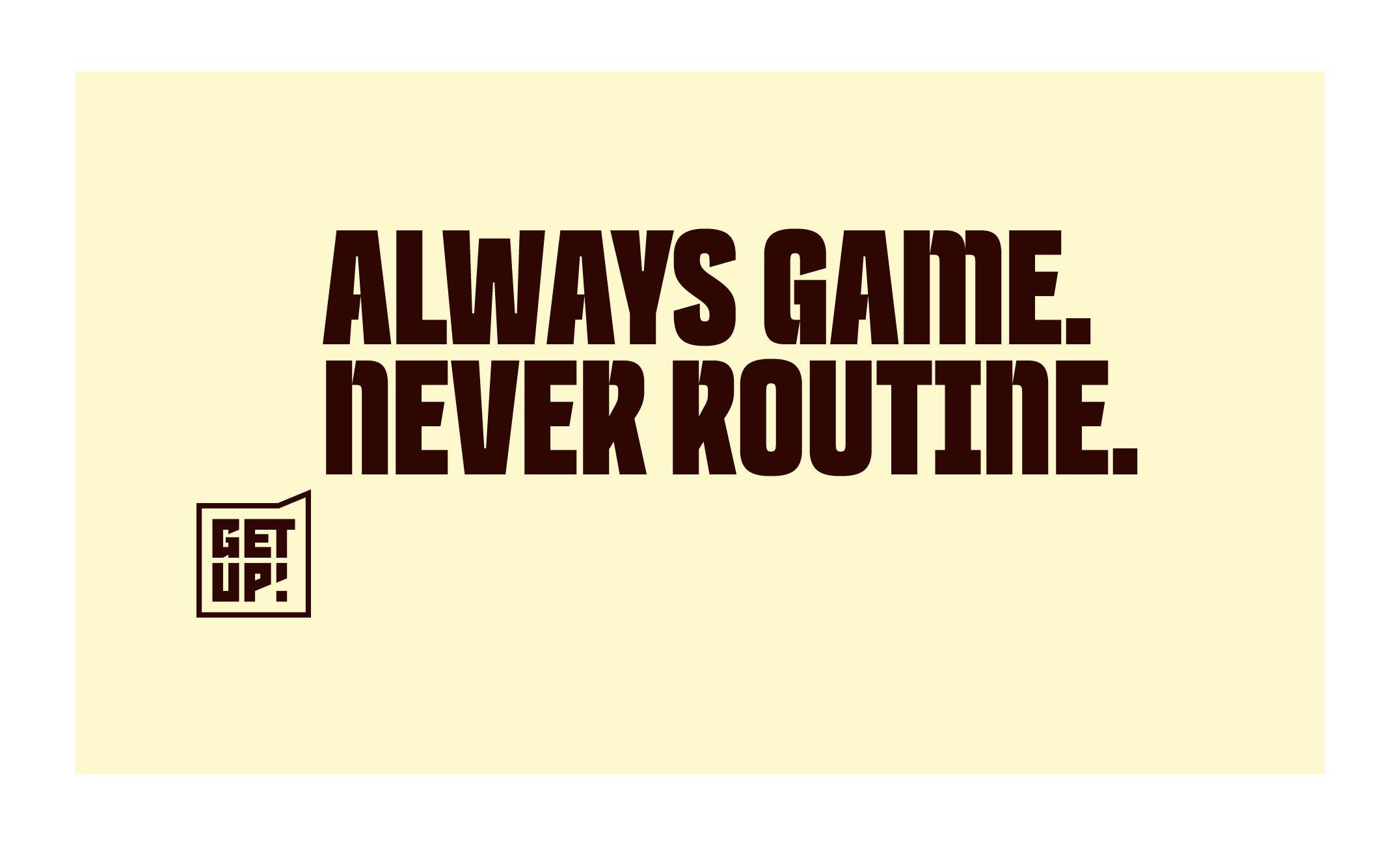
We spent many a session racking our brains for a name that would instantly communicate the energetic vibe of the show. GET UP! took a while to be christened and sanctioned, but ultimately made the grade for two big reasons: It feels damn good to say and proved incredibly versatile when activated.

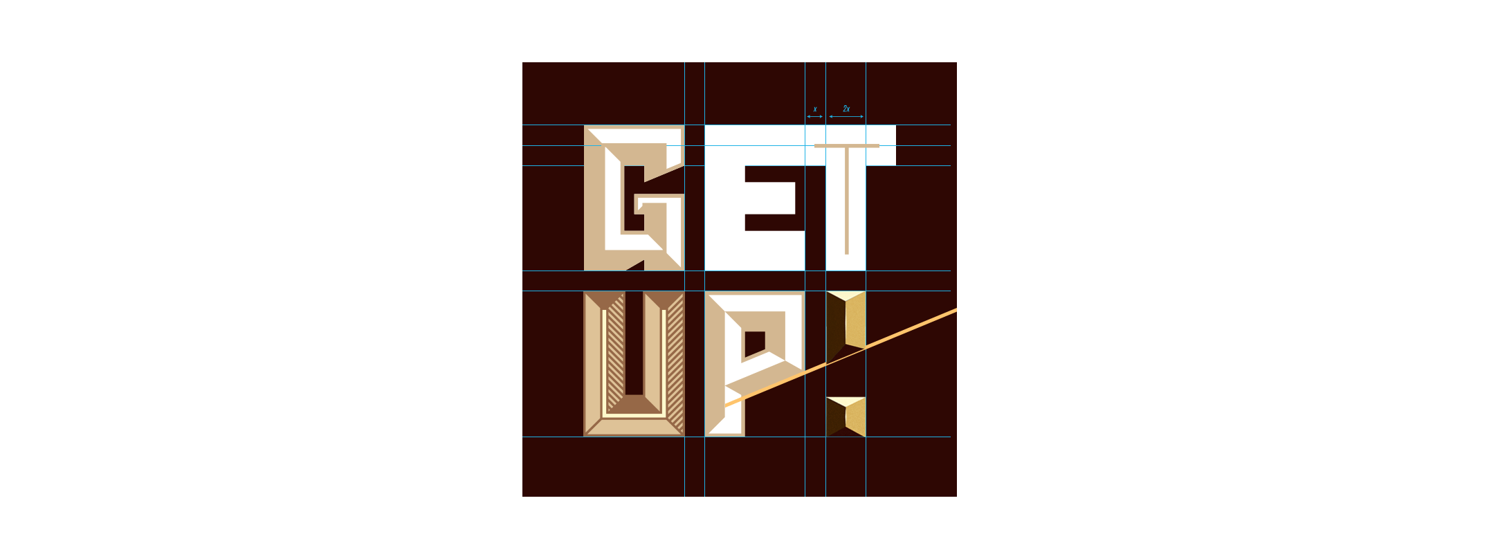

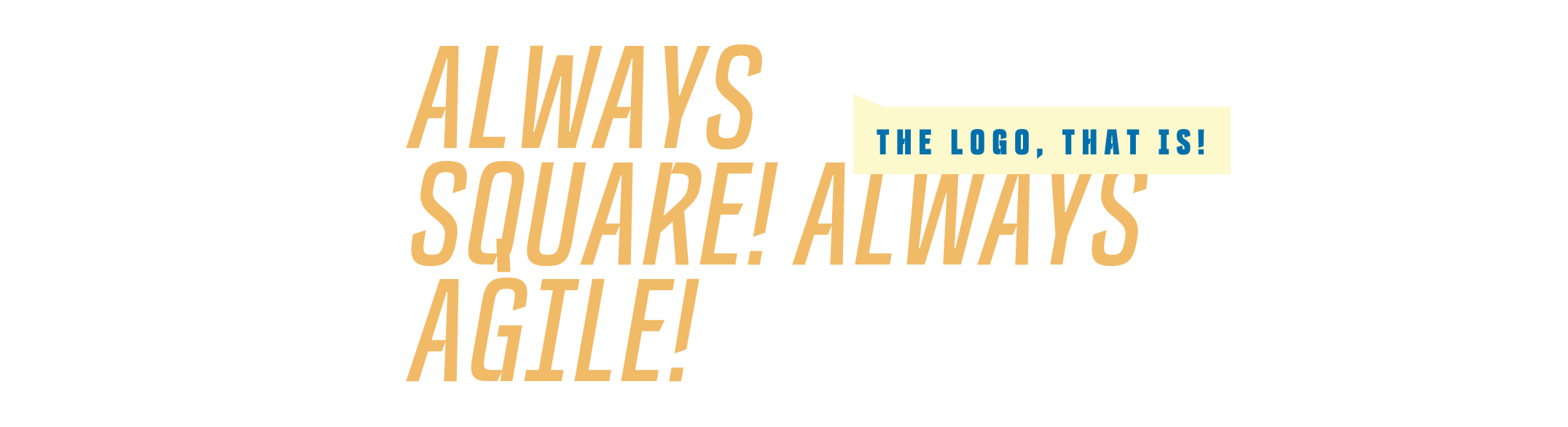
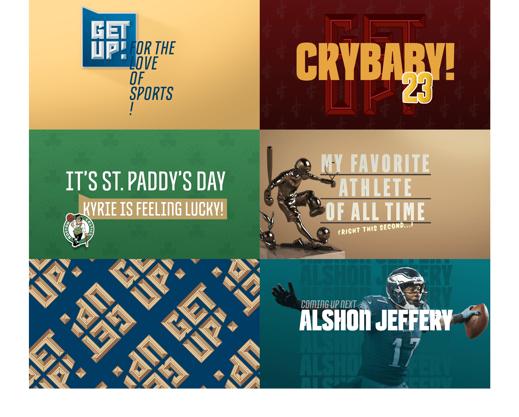
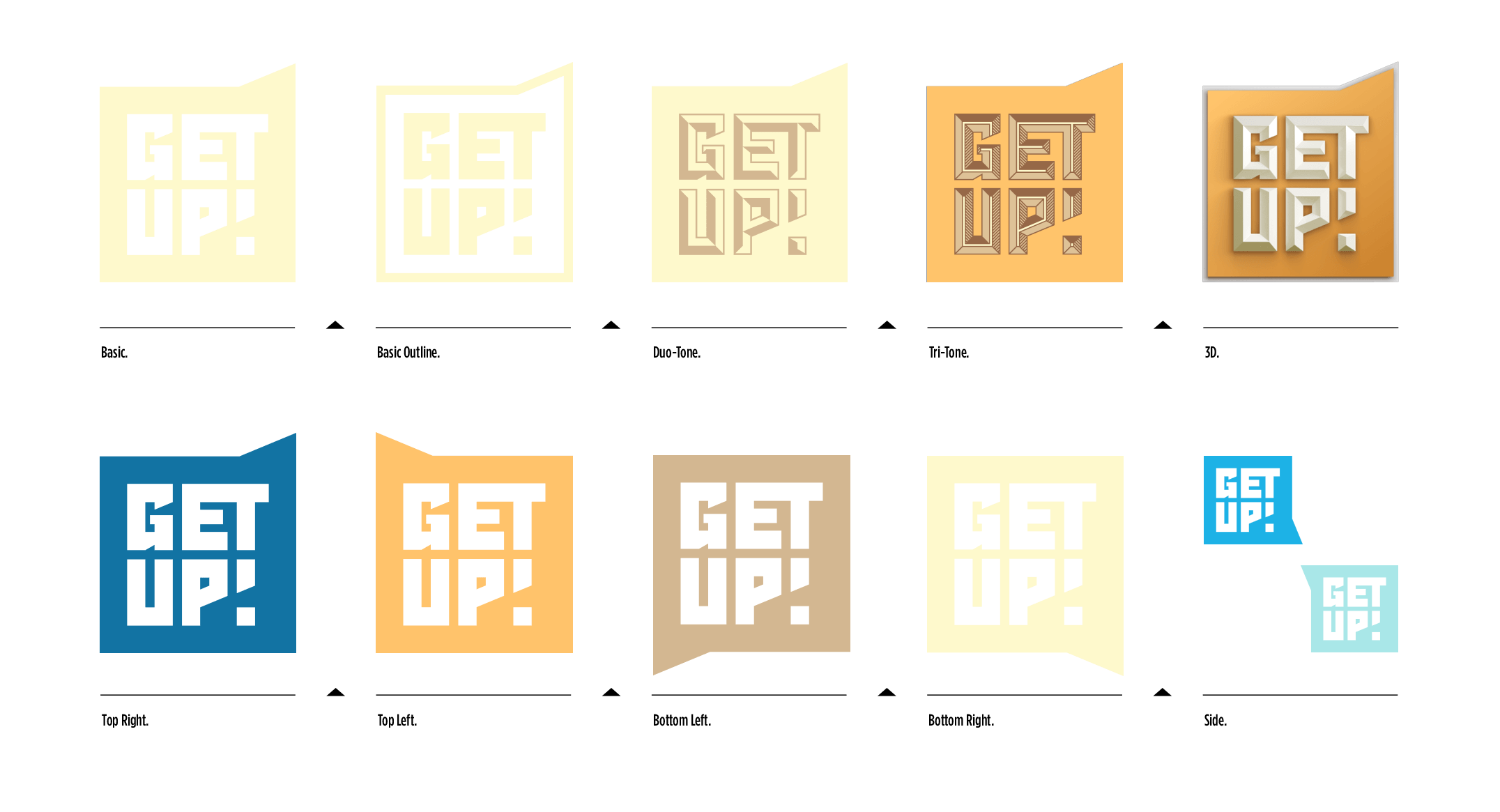
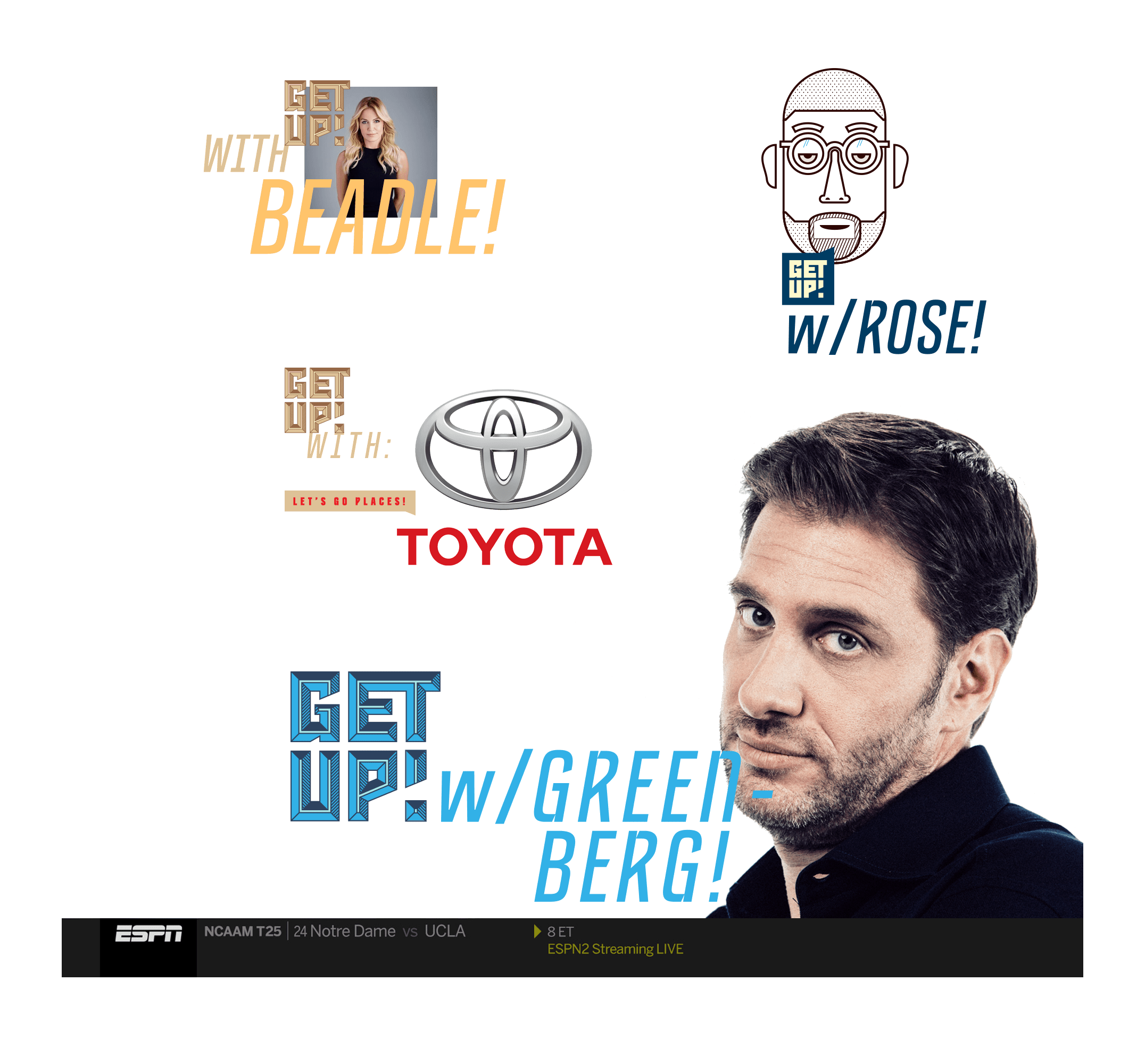
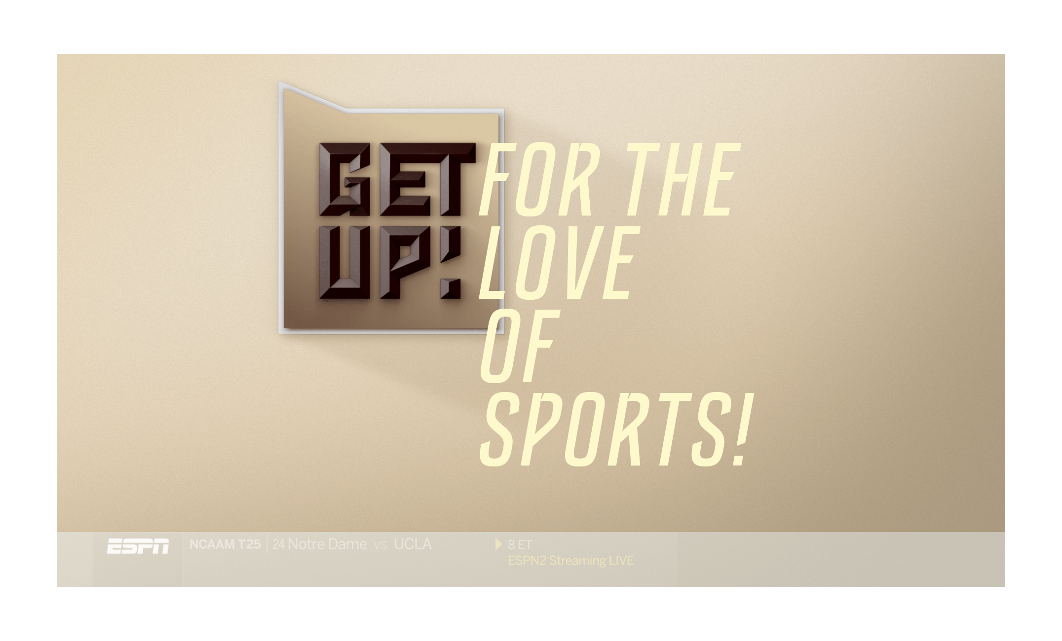
Branding is all about striking the right balance between coherence and consistency. Modern brands need maximum flexibility for an ever-evolving list of formats. We designed the GET UP! logo to be a square. Always. Yet in order to create enough variety for the brand, we built five different logo treatments
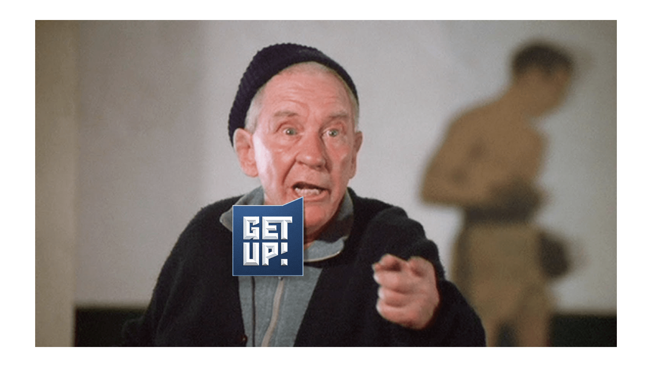
The GET UP! mark was designed to be a motivational cue. To that end, every logo variation also comes in additional orientations.


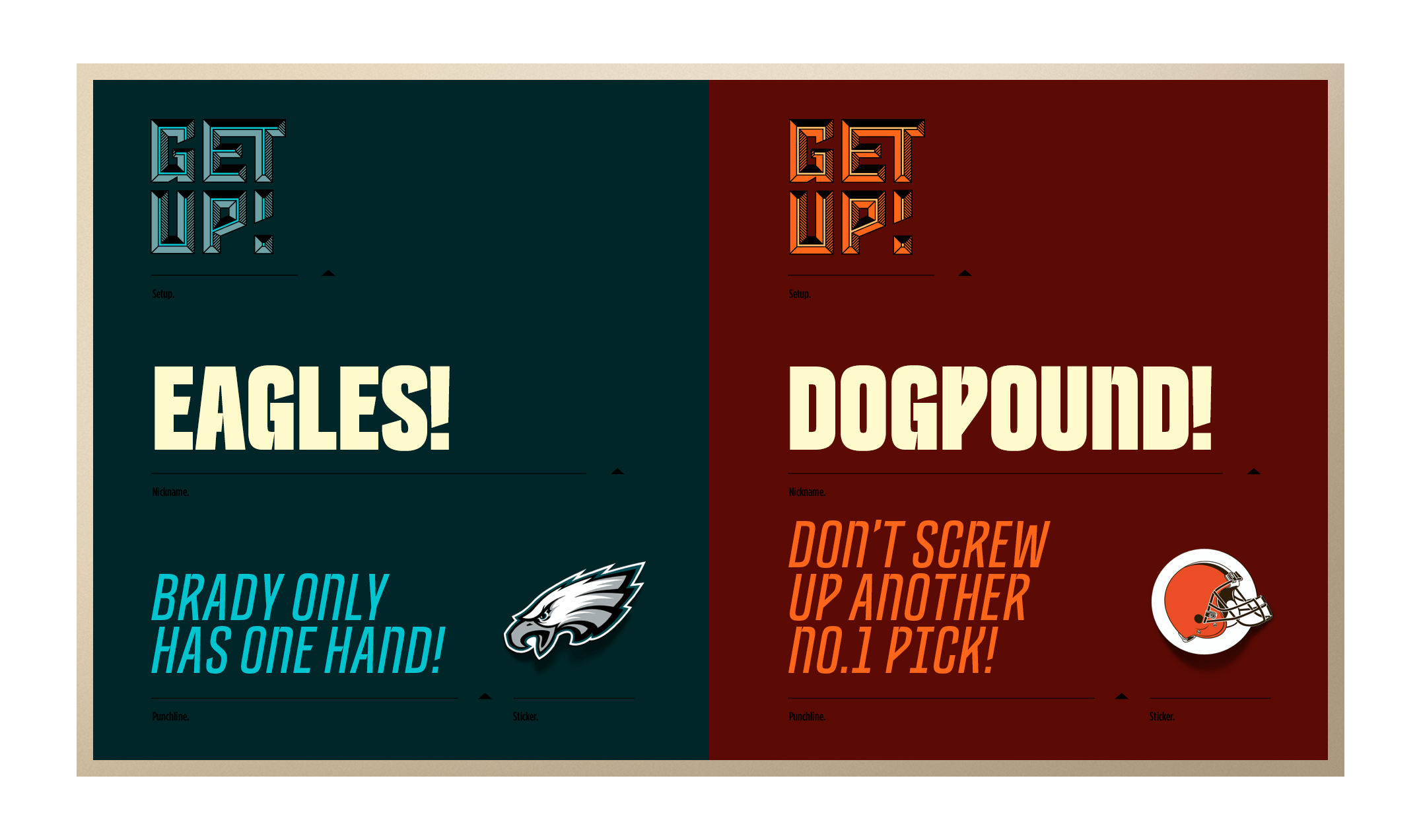
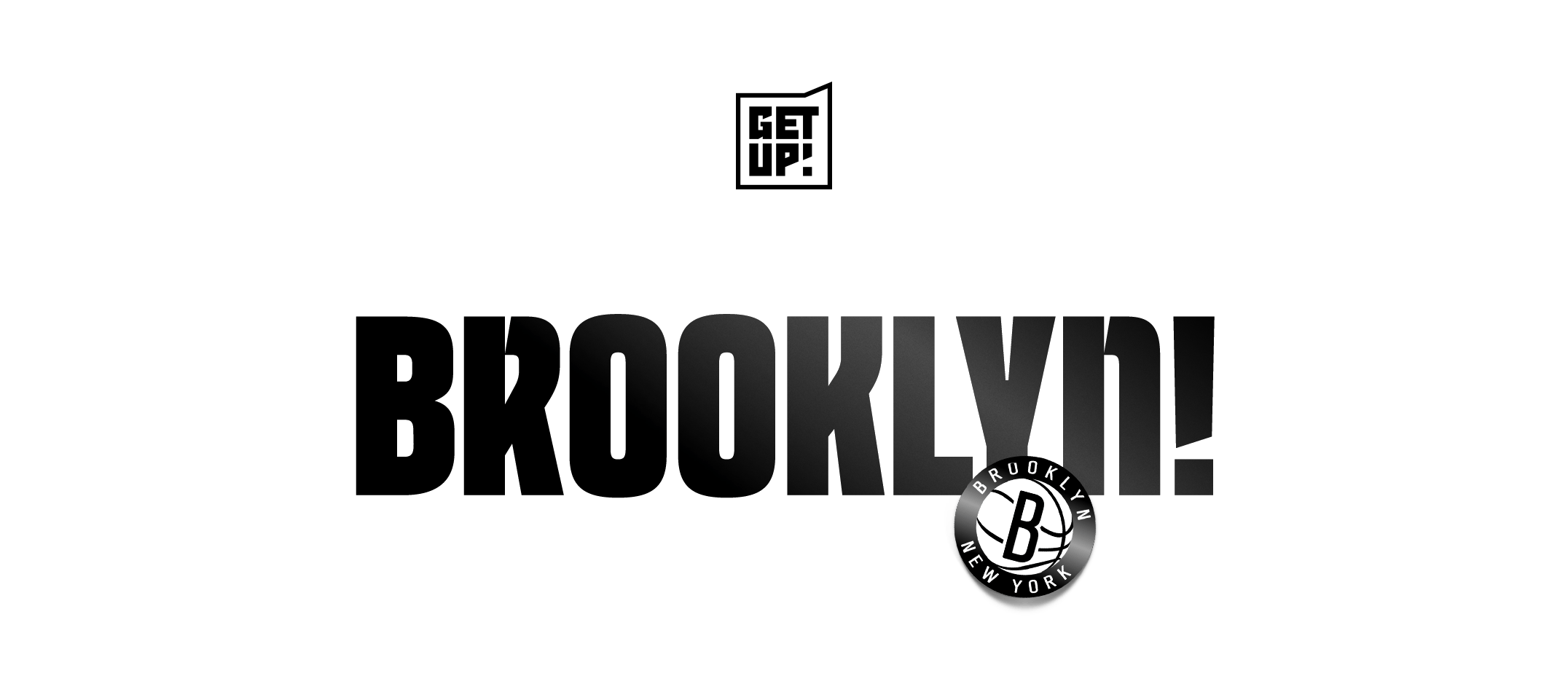
The voice of the GET UP! brand is unique, just like each city is home to its own community of sports fans with their own quirks and traditions. The brand truly shines when integrated with local vernacular through elements like language and color.


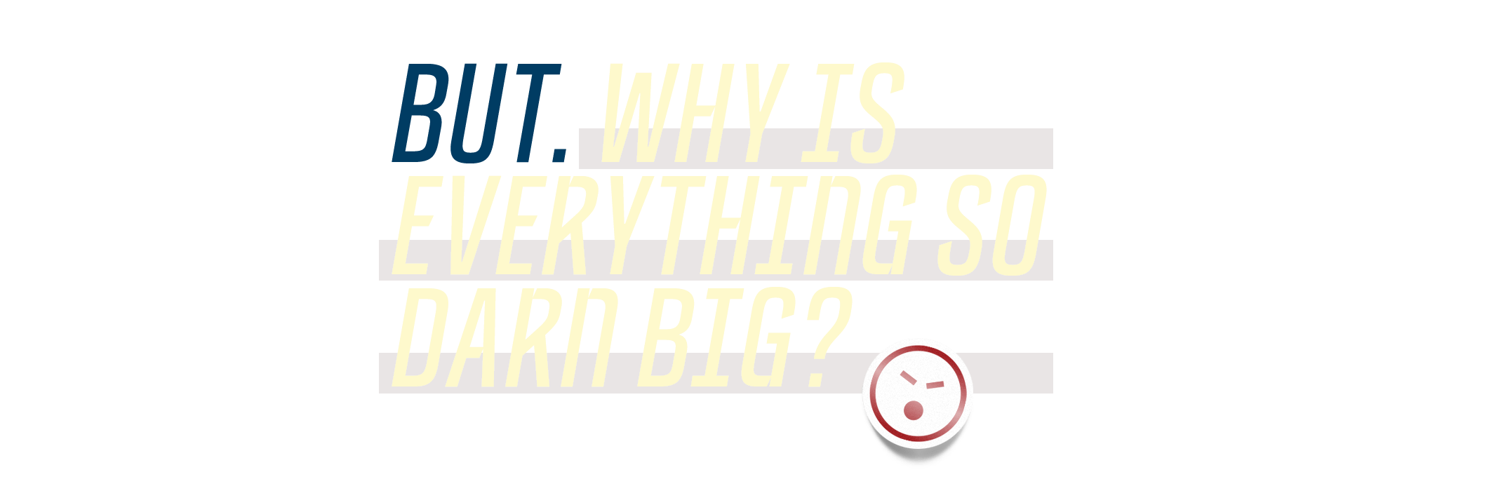
Thanks for asking!
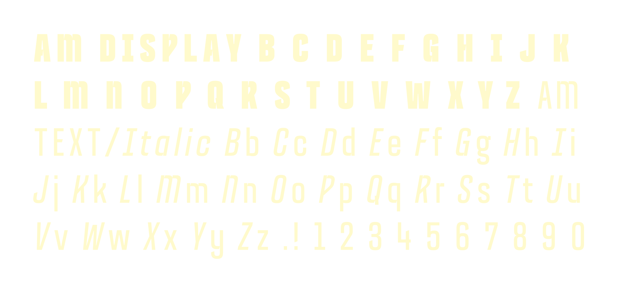
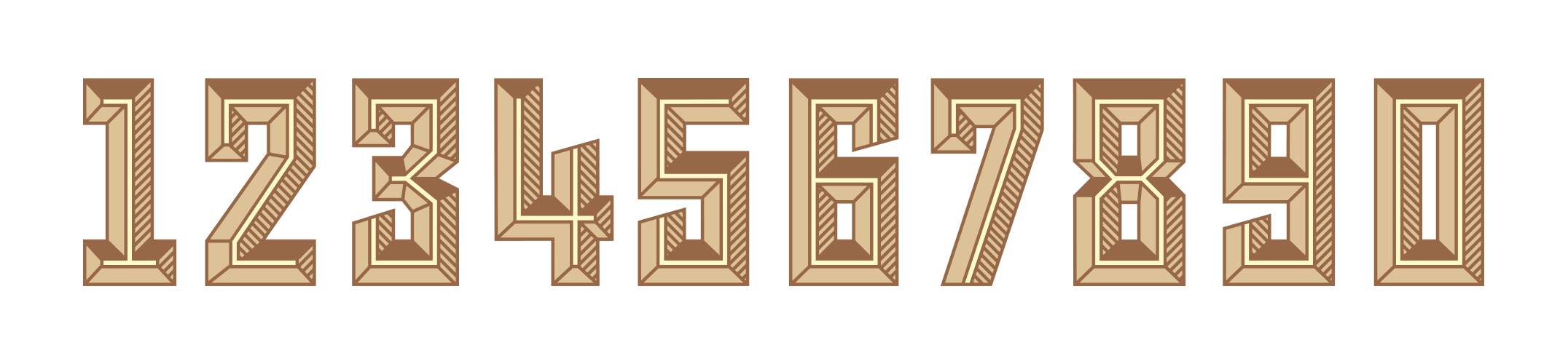
It’s called AM DISPLAY and TEXT. We designed it to complement the logo and be recognizable whenever and wherever we use it. It’s bold, friendly and fun. And no, you can’t buy it. Sorry.

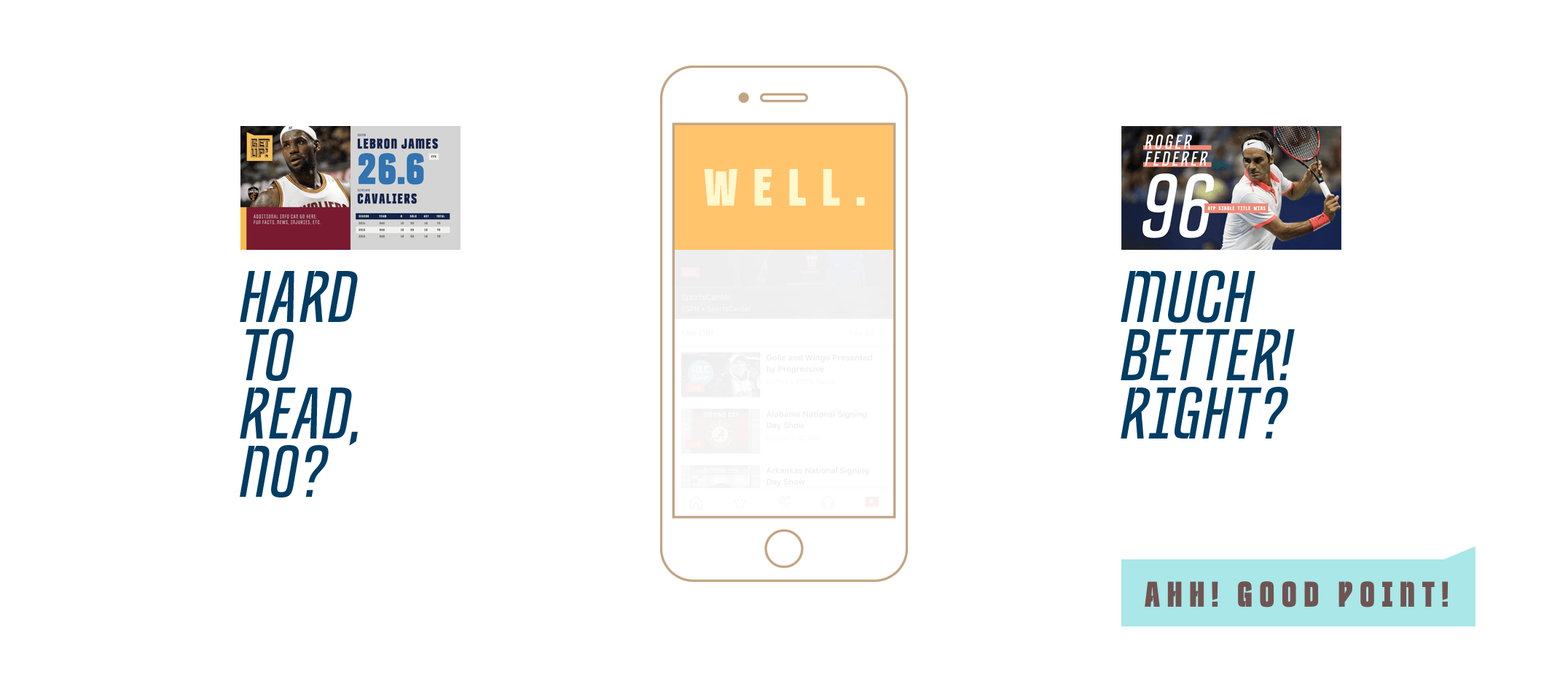
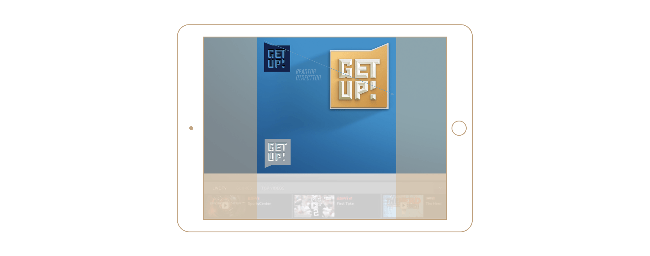
We reverse-engineered all graphic elements for maximum legibility on all devices. Type is big, and information is delivered over time, as opposed to cramming everything into a single frame. What’s the point of stats if you can’t read them? Logos are also strategically placed so they’re the first thing you see when scrolling. Plus they fit into a square, so elements can be easily repurposed for that crispy Instagram feed.