Hot on the heels of our radical reimagining of the master brand, SYFY tasked us with putting our own design philosophy to the test: How can we unite the iconic worlds of SYFY and Harry Potter with an “editorial-first” approach that allows both brands to shine in bold new ways while creating something totally original in the process?
To add a fun twist to this challenge, we also needed to design a system that didn’t feel out of place on SYFY’s sister network, USA.
So we turned to the one place where everything started for Harry in 1997: Books.
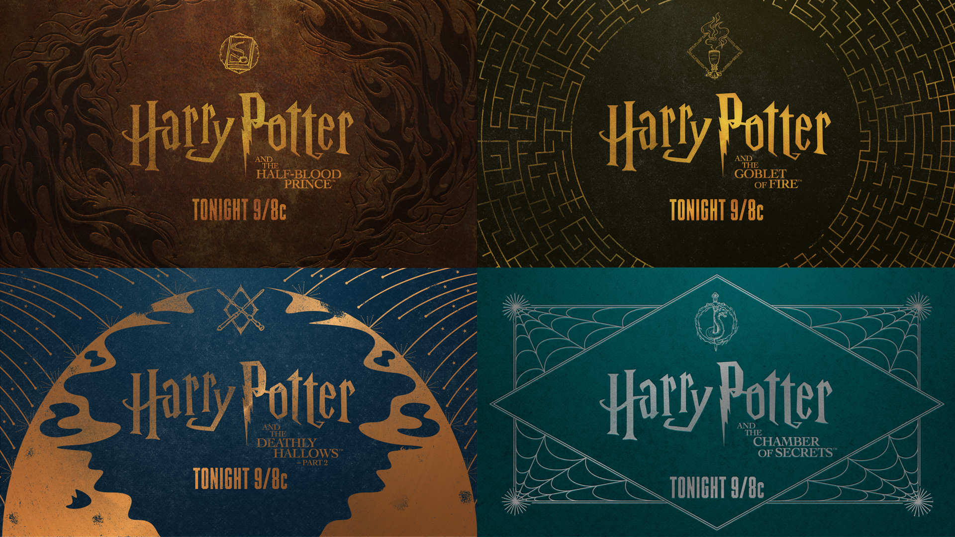
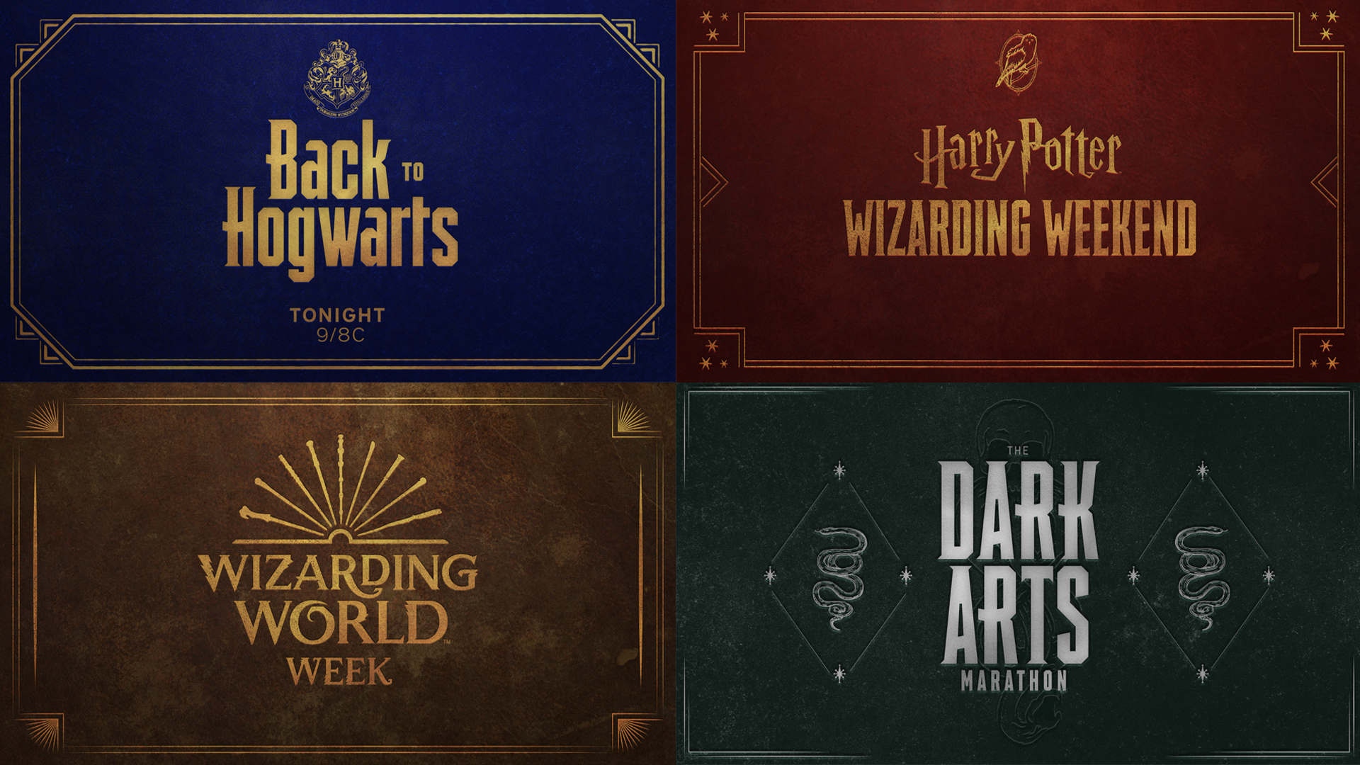
Early in the process we latched onto two themes: decorative spell books and iconography. We created a unique emblem to reflect each movie in the Harry Potter library and used them as foil stamps or embossments on our book covers. Beyond the individual films, we designed additional covers for special weekend stunts like The Dark Arts for Halloween or Back to Hogwarts.
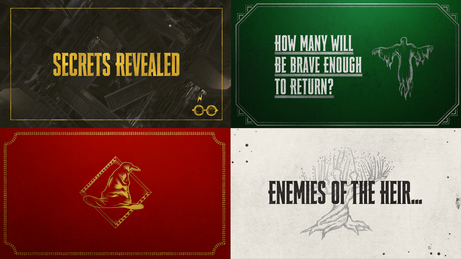
Because we were fortunate enough to have rebranded both SYFY and USA, we were already aware of both brand’s unique strategies and needs and were able to use typography to meld all the magic. We took the opportunity to create a new version of the SYFY Hero font we created for the 2017 rebrand. This new font would have enough unique personality to live on USA without feeling like a SYFY takeover, and be similar enough to SYFY Hero to feel like a natural extension of the master brand. So we combined SYFY Hero with some of the distinguishing features of the Harry Potter logo and created Flagrate (it’s a spell in the Harry Potter’s universe).

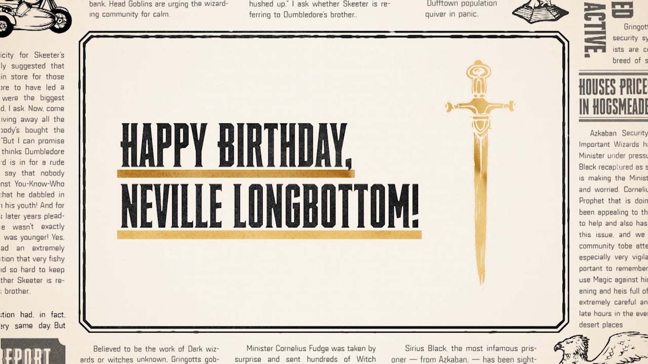
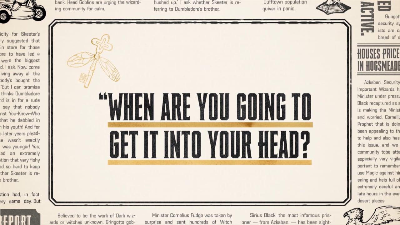


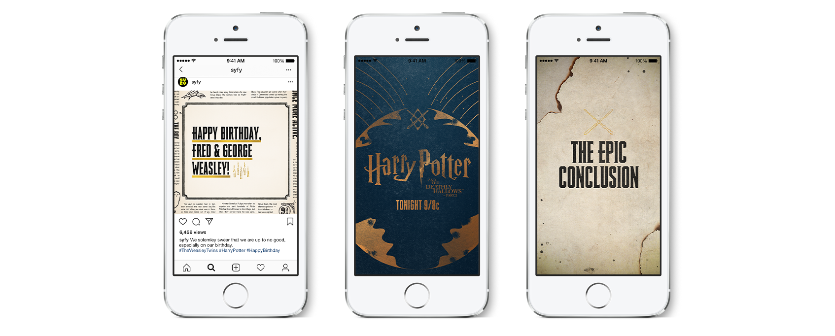
As part of our delivery, we translated all of our designs into social sizes so SYFY and USA could spread the word of Harry Potter movie marathons and Potter birthday celebrations across all platforms with a consistent campaign. More efficient communication than an owl.


